Generally, a logo change is not something I would normally write about. But I cannot hide my fondness for AerynOS, a promising distribution that is not just another entry in the crowded Linux landscape but a serious project with real potential.
It brings genuine innovation through its rolling-release model, atomic updates, and its own tooling stack. Above all, it is built entirely from scratch, placing it among the small elite of so-called “original” distributions. But back to the point.
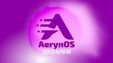
AerynOS appears to have quietly changed its logo. The new mark is now visible on the project’s website, documentation, and GitHub repository, but there is no dedicated announcement. This makes the update easy to miss, especially since recent communications have focused mainly on distro development, package updates, and tooling rather than branding.
So, to make things clearer, here’s what the logo looked like until now and the new one:
Ultimately, design professionals will have the final say, but in my view, the new logo is more visually appealing. The change moves away from the rich purple that defined the distribution’s branding toward softer, more “camouflage” tones. Overall, it feels more cohesive than the slightly chaotic “A” used previously.
That said, this is just a personal opinion. From a marketing perspective, though, the new design appears to align more closely with current trends and should better support the distribution’s overall image.
To tell the truth, the change does not come entirely out of nowhere. In its January 2026 update, AerynOS said it was working on branding, a new website design, and logo proposals. The team presented this as part of a broader effort to refine the project’s identity, alongside documentation and other project-wide changes.
Apart from the logo change, AerynOS, still in alpha, continues to provide users with the latest from the open-source world. Recent updates include moving the Python stack from 3.11 to 3.14, kernel packaging changes, and the latest KDE Plasma 6.6.4, Frameworks 6.25, Qt 6.11, PipeWire 1.6.3, Flatpak 1.16.5, Docker 29.3.1, Nano 9.0, and more.
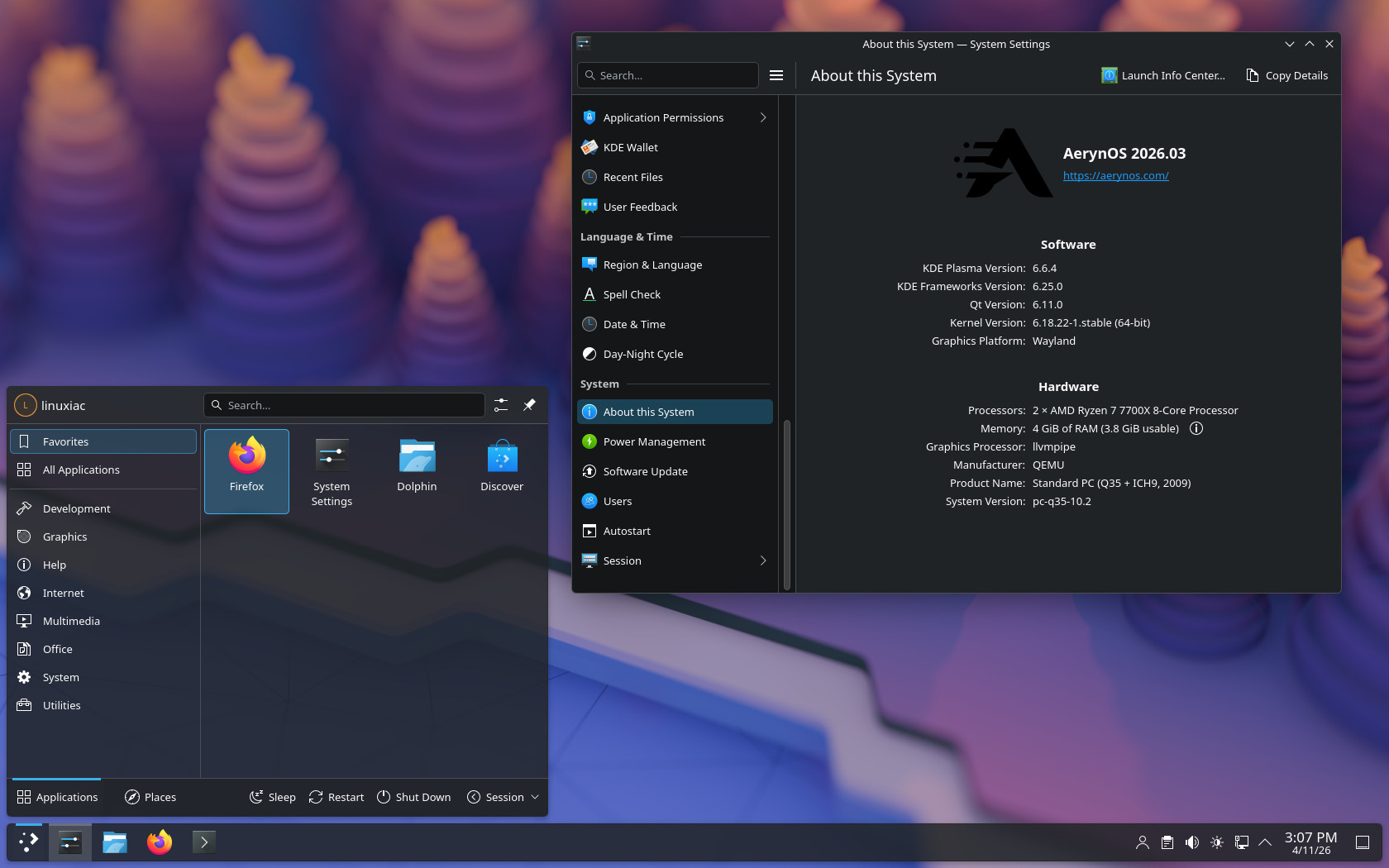
As you can see from the image above, the branding in desktop environments hasn’t been updated to the new logo yet, but that will likely happen in an upcoming update.
In conclusion, AerynOS is about to get a complete visual refresh. A little over a year after changing its name from Serpent OS to AerynOS, this logo update largely completes the shift to its new visual identity. On a personal note, I think it’s a move in the right direction.
From here on, we’re eagerly waiting for the distribution to move beyond alpha. Based on my experience, it already runs stably and predictably, so I highly recommend giving it a try. It has a lot to offer and plenty that might win you over. Oh, and I almost forgot – it’s incredibly fast.


Just a logo, true, but I rather like it!
I keep a close eye on this one, may need try again soon as it progresses. Would love a Cosmic flavor 🙂
Great work Aeryn team
Thank you!
And as Bobby has pointed out, we have a Gnome live environment but our actual installer (lichen) is a net installer that pulls down the latest packages for installation. You can install:
Gnome
KDE Plasma
Cosmic
Two versions of a terminal only (one for ethernet and the other including WiFi)
These will allow for future server scenarios or for people wanting to use MangoWM, Niri or Sway (all of which are already in our repo too).
Lichen is a TUI installer from within a terminal. As we progress, we will eventually develop this into a GUI installer.
If I may say so, there are no flavors here. There’s a basic GNOME live image, and during the terminal-based installation, you’re asked which desktop environment you want to install, with all the major options available, including COSMIC. 🙂