GNOME 41 is the second release to use GNOME’s new version numbering scheme. This replaced the old odd point release approach with a simpler, single integer. For your information the next GNOME 42 release is planned for March 2022.
Here are some of the big additions in GNOME 41.
GNOME 41 Software Center
The first big new thing in GNOME 41 is the GNOME Software Center. The Software Store is where you download apps. It needs to be nice, to look good, to be enticing and present the apps in a user-friendly way, which GNOME 41 Software Center really does.
It has been completely redesigned and it looks pretty good. The GNOME Software Center got a whole new look and interface. The home page has been vastly improved with big colorful headers for featured apps, a list of categories with some nice artwork and some editors picks to showcase specific applications.
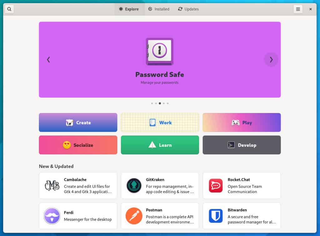
The GNOME Software Center is now more adaptive and it should look better when resized to small width. The application pages also have received a lot of love. There is a lot more info presented in a much more user friendly-way.
Now let’s move on to the desktop side of things. The layout itself hasn’t changed much since GNOME 40. GNOME 41 builds upon these changes to improve the free desktop for new and experienced users alike. You still get the horizontal workspaces, the dock on the bottom and the app grid.
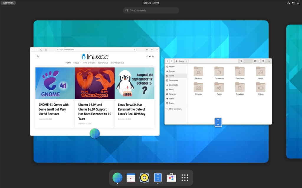
GNOME Settings
You now get a lot more options to change how this layout works through as the work to port GNOME Tweak Settings into the main Settings app continues.
You will find a new “Multitasking” settings panel with a bunch of options. The firsty one is the ability to disable the hot corners for the activity view. You can also disable the tiling of windows when moving them to a screen edge.
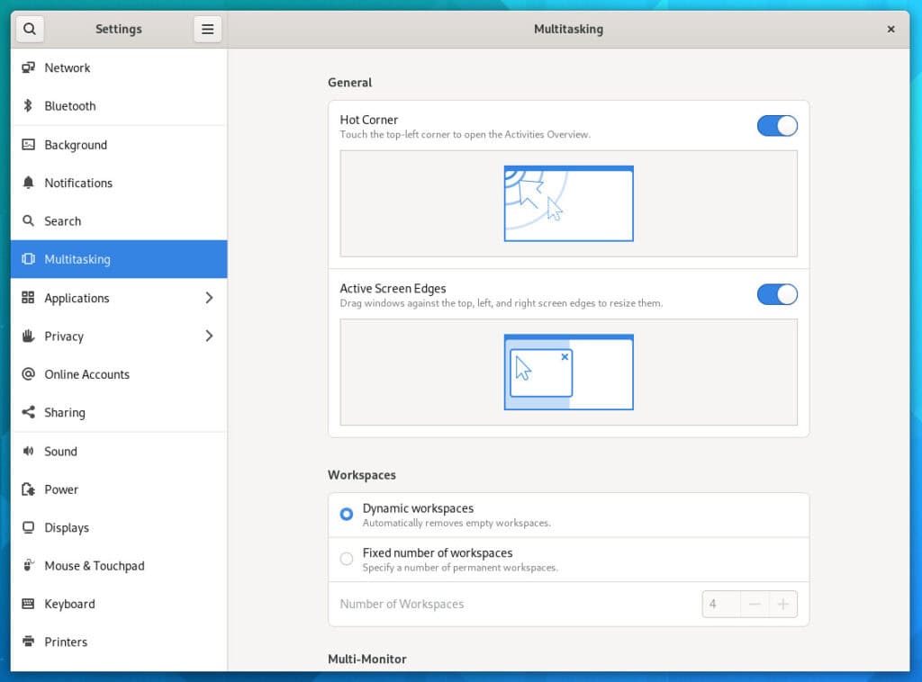
Workspaces can also be configured to be dynamic. You also get to choose if your workspaces span all of your displays or are limited to your primary display, with secondary monitors having their own unique workspace. That is another welcome improvement for multi-monitor users.
Finally you can decide to display apps from all workspaces when using Alt+Tab or only count those from the current virtual desktop.
System Settings also contains a “Cellular” section. It only appears on devices with the necessary hardware, but if you are using GNOME on a cellular-equipped laptop, you can now manage cellular networks like you would in a Wi-Fi one.
So, definitely all these settings are really welcome although some might argue that these should have been there from the beginning since GNOME 40.
Enhanced Power Management
On laptops and devices with battery you also get power profiles directly from the main system menu. By default the system is on “Balanced”, but you can manually go into a “Power Saver” mode that you can also trigger automatically when your battery gets low.
You can disable this behavior in the “Power” settings if you don’t like it.
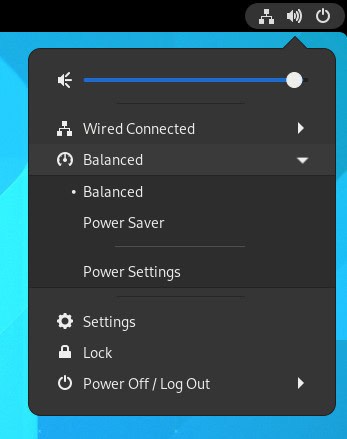
Something that is interesting to note is that now specific applications can request specific power profiles. For example a game can bypass the power saver setting to get access to the most CPU power, RAM, and use as much power as it wants.
New Remote Desktop Client
GNOME 41 comes with a brand new application for handling remote desktops called Connections. This provides a modern, easy to use experience for connecting to other desktops, and automatically handles as much of the complexity for you as possible. It can handle RDP and VNC and connect to Windows, macOS, or Linux hosts.
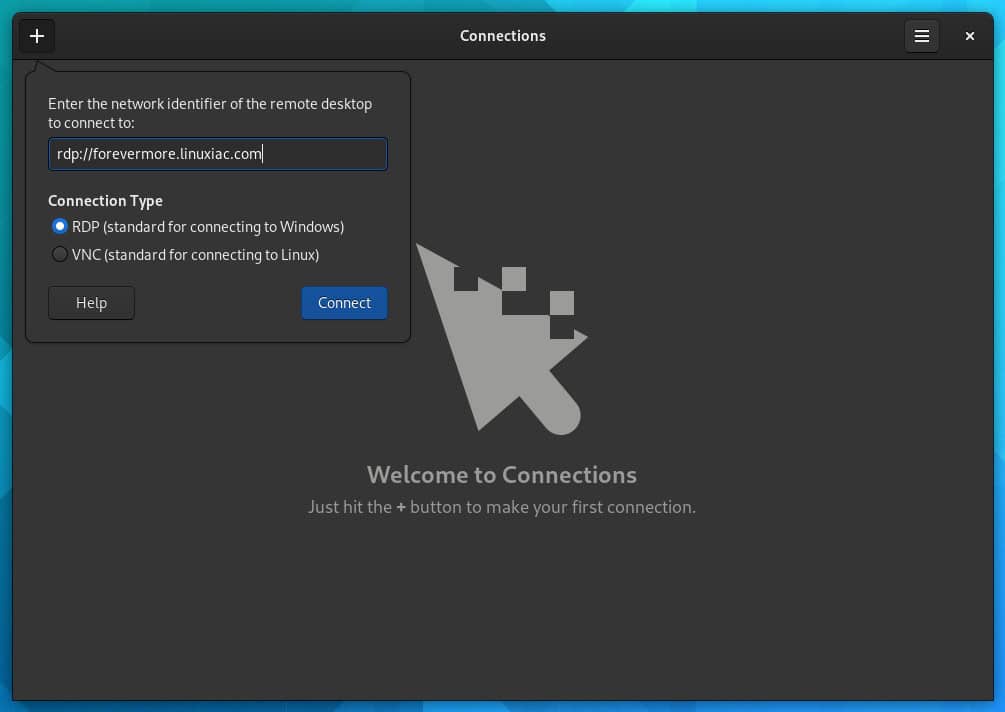
Connections replaces the remote desktop functionality that was previously found in Boxes.
Music
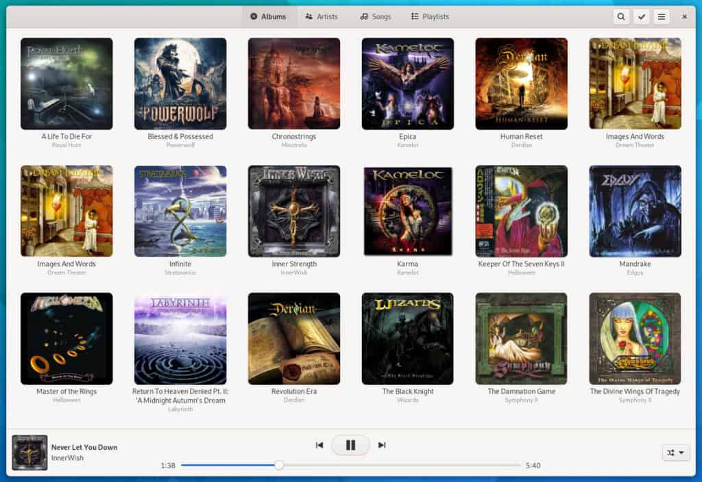
Music has been given a round of UI updates for GNOME 41. Artwork is now larger and has rounded corners, the artist list includes images, a new album view includes a handy play button, and the redesigned player bar is more spacious. Music also has new welcome artwork.
Other Improvements in GNOME 41
GNOME is continually working to improve performance, responsiveness and smoothness, and GNOME 41 includes a collection of improvements in this area.
- Efficiency improvements in GNOME 41 mean that the screen will update faster in response to keyboard and pointer input. This change only applies to those using the Wayland session, and the effects will be more noticeable with some displays rather than others.
- System-level multitouch gestures now behave more reliably and consistently.
- GTK 4 has a new default GL renderer, which provides faster rendering and reduced power consumption.
The mouse and touchpad panel has been also redesigned, with a colorful new page for you to try out your mouse or keypad settings.
The GNOME file browser has a couple of enhancements. A new menu item allows you to create a password-protected ZIP file.
As usual, many apps in GNOME 41 also receive a few new features. Calendar now supports importing ICS files. Calls, the app for placing voice calls from a GNOME-powered device, now lets you add SIP accounts and place VoIP calls. In addition, the GNOME Calculator has been redesigned with colored buttons for the equal sign and the clear button. Enlarging the window will now reveal additional controls, and the window will also shrink down to fit on mobile displays.
You can read the full GNOME 41 release notes here.
Conclusion
In GNOME 41 the big graphical redesign of Adwaita isn’t there yet. So it might be coming for GNOME 42. It is normal to have a moderate release after a big one. But if you like GNOME and use it, there is basically no reason to not upgrade to GNOME 41. It is smoother, faster, apps are better, and there is more tweaks and options.
Basically, click that “Update” button if your Linux distribution offers it.
Getting GNOME 41
Unfortunately, while GNOME 41 was released, most people cannot truly run it yet. You must wait for your favorite Linux distribution to provide it to you. As usual, rolling-release distros like Arch Linux will see it first.
At the moment you can take GNOME 41 for a spin by downloading the GNOME OS ISO. It is not intended for daily use, so you will probably want to use it in a virtual machine such as GNOME Boxes just to take a look at it.
