
Thunderbird’s dev team has just released an interactive prototype of the new desktop settings UI. You can now play with the proposed changes and give them your feedback before the new interface is rolled out to the client.
According to the devs, the redesign is the result of a research study with 381 Thunderbird users from 42 countries. The study examined how easily users could find their preferences in a proposed settings structure and highlighted several areas where the structure could be improved.
To get this feedback, they used tree testing, where the users navigate a text-only hierarchy to find the option they’re looking for. By stripping away all the icons and colors, you’re left with just the category names and how the settings are structured.
Results were mixed. Around 60% of the participants were able to find the appearance-related preferences, as some of them initially searched under Themes. The update controls and mobile setup options were generally quite good; other areas were less so.
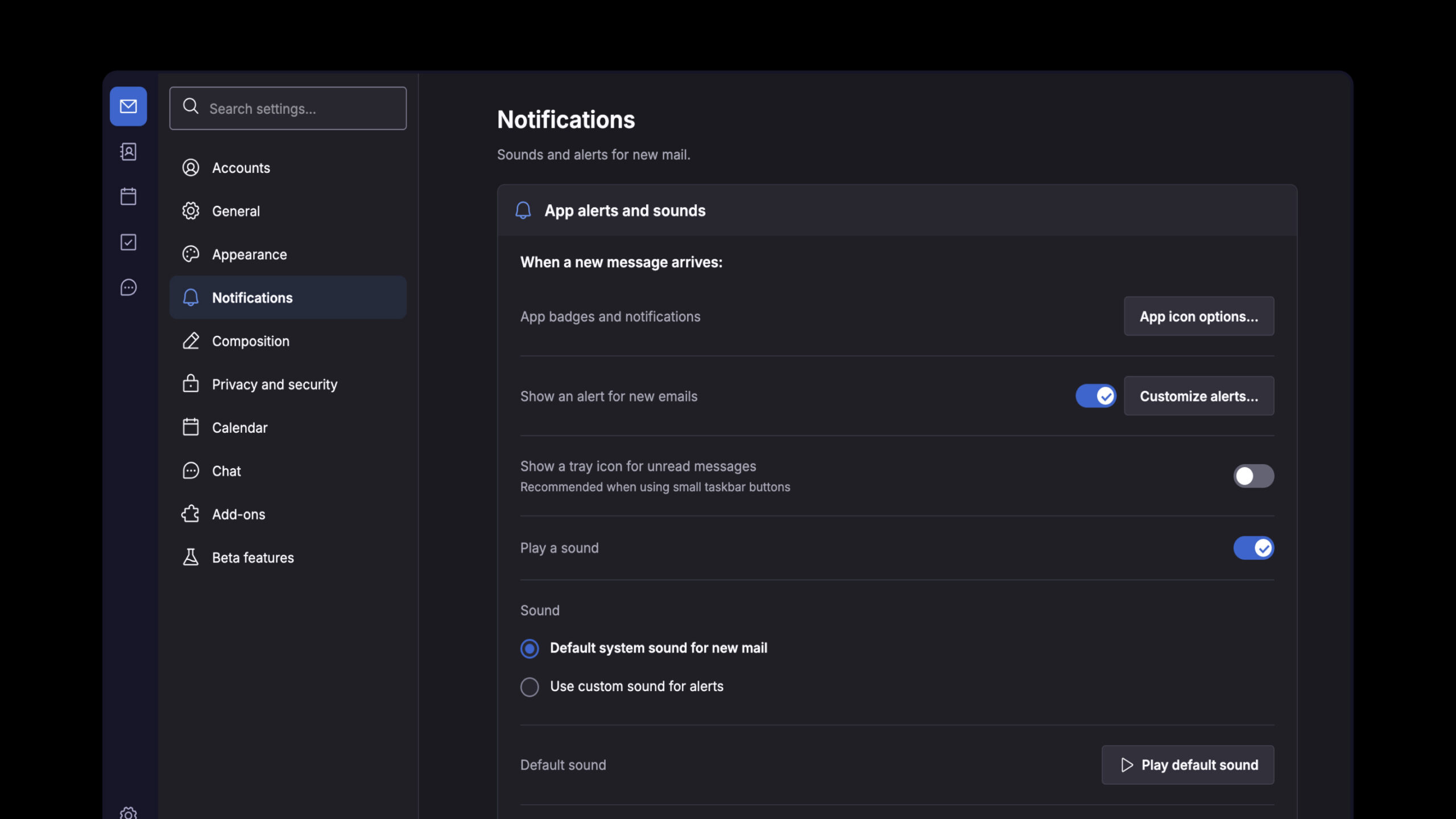
For instance, users were asking why Calendar and Chat had their own top-level categories when the core email settings were all grouped under Composition. There was also confusion around the difference between Appearance, Themes, and Add-ons & Themes, as they all seemed to serve the same purpose.
Another problematic one was ‘New Features’, which left people quite confused about whether that section would be release notes or experimental features. People suggested a number of alternatives to that, including Thunderbird Labs and Experimental Features.
The research also confirmed that many experienced users (particularly Linux users) will use the settings search bar rather than go through the categories. As tree testing can’t test the search functionality, testing the interactive prototype is the next logical step.
Feedback wasn’t all positive. Of those who gave us detailed feedback, about 35% were happy with the proposed organization, around 20% were concerned about the sheer number of interface changes, and these users were very clear in their desire to maintain the status quo in terms of existing workflows, to keep dark mode working reliably and to avoid any redesigns which would in fact offer no benefit at all.
One thing people frequently mention is the split between the application’s global preferences and individual account preferences. That’s not something Thunderbird is going to be fixing in this redesign, though, as it would require a much deeper level of architectural change to bring those two areas together.
So, the team has now revised the proposed settings structure and has an interactive prototype available for testing. This shows the new structure, though, of course, some of the controls are not currently working, and the interface doesn’t currently switch its terminology between Linux, Windows, and Mac.
Some related improvements have already reached Thunderbird 160, including terminology changes that replace technical jargon with clearer language. The broader settings reorganization, however, is still in development.
According to the team, the redesigned settings will be implemented gradually, with individual changes tested before reaching Thunderbird’s beta and stable releases.
For additional details, see Thunderbird’s announcement.
Image credits: Thunderbird