
Linux Mint is a community-centric Linux distribution that has gained a loyal following over the years thanks to its focus on providing a user-friendly operating system that puts the needs of its users first.
At the heart of Linux Mint is the Cinnamon desktop environment, which provides an intuitive and modern interface that makes it easy for users to get things done.
In exciting news for the Linux Mint community, Clement Lefebvre, the project lead for Linux Mint, has recently announced that the Cinnamon desktop environment will receive a refresh and new features in the upcoming 21.2 “Victoria” release. So let’s see what it is about.
Icons Redesign
In its current release, Linux Min 21.1, the developers decided to replace the view of the main folder icons with ones with a stripe.

Although this visual adjustment is refreshing, the community has not received it well. So, keeping with its philosophy of being a user-centric distribution that listens to the community’s voice, Linux Mint 21.2 will revert to a cleaner look for the icons, removing the stripe.

At the same time, the wide variety of themes and color options in Linux Mint 21.2 creates clutter and makes it difficult for users to find a specific theme. In this regard, the devs removed the brown accent theme from the next OS release.
No More Monochrome Icons
Using monochromatic icons in apps and menus gives an excellent aesthetic look for apps but also presents some purely visual challenges, especially when using a dark theme. This is what a menu with monochrome icons looks like when a dark theme is used:

As may be seen, the icons themselves are almost invisible. To address this issue, Linux Mint 21.2 will entirely rely on symbolic icons, which have excellent support in GTK4, removing all monochrome icons and all dark icon themes.
New Cinnamon “Styles” Feature
Linux Mint 21.2 “Victoria” will provide users with a new version of its flagship desktop environment, Cinnamon 5.8, including a brand-new concept called “styles.” In short, it is the ability to apply one of three global styles to the desktop environment: mixed, dark, or bright.
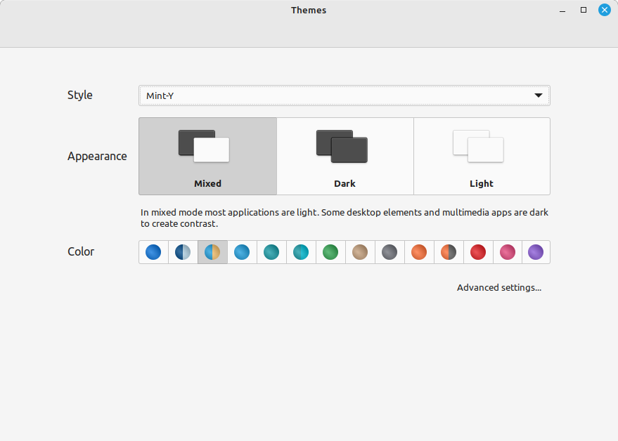
On top of that, there will be three modes in style – mixed, dark, and light, as each can contain color variants – a combination of themes that work well together.
The main idea is that users can quickly and easily switch to their preferred desktop environment view only with a few mouse clicks. In addition, Mint-Y-Legacy was renamed Mint-L.
New Yaru-inspired Icons Color
Linux Mint gives users nearly any icon color palette you can think of. However, being closely tied to Ubuntu, on which it is based, the next Linux Mint 21.2 release adds a new color scheme to its collection, greatly influenced by Ubuntu’s Yaru theme.
Bottom Line
Mint is set to undergo some visual changes with the upcoming Linux Mint 21.2 “Victoria” release. They will affect the appearance and are made as always for a better user experience.
In addition to the visual changes, the new Mint’s release will make it easier for the theme designers to create their themes. All Cinnamon styles will be defined in JSON files in the “/usr/share/cinnamon/styles.d/” directory, making designing new visual themes straightforward.
However, we’ll have to wait to enjoy all these changes, as Linux Mint 21.2 “Victoria” is scheduled to arrive in late June. In addition, the new Debian 12 (don’t forget LMDE) is also expected to be released around the same time, so we have some exciting months ahead.


The best tweak for me would be a mint installation that is actually smaller. I don’t need colour schemes or folder tweaks. Just a reliable OS without unnecessary calories
Second the title bars – if you have a lot of apps open at the same time (calculator on calc) then it’s hard to spot where they are as they lack contrast. I’m not really into the thick keyline css bodge…
Honestly, I can’t care less about this stuff. Mint works so reliably well that these little nuances and appearance flickers aren’t even noticed – at least not by me. Adding a little stripe to a folder Icon was not well received? Please Give me a break!
That’s great, but I still want them to bring back the ability to change the colors and icons of the window title bars like we had with Metacity.