Another six months of development later, and the long-awaited GNOME 42 is out with plenty of enhancements for GNOME desktop fans. GNOME 42, like GNOME 41, does not include significant changes to desktop layouts.
However, many other improvements have been made, covering them in this article.
GTK4 and Libadwaita
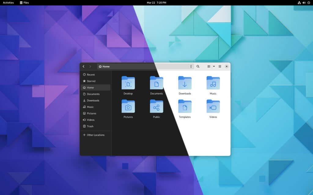
The major porting work for libadwaita began with the release of GNOME 41 continues with this version. So GTK4, the core programming toolkit for GNOME and all GNOME programs, is the big new thing. It includes libadwaita, a new library that controls how GNOME apps look.
As you know, earlier versions of GNOME didn’t have system-wide themes support. They just had one theme. Libadwaita transformed this into a platform-wide look in GTK4. But what’s that mean? In short, all apps that use it should look similar.
Individual libadwaita improvements are difficult to illustrate because they are woven into every aspect of the GNOME 42 desktop. For example, flat buttons, attractive drop-downs, page animations, and toast messages are the few enhancements introduced by libadwaita.
Folder Icon Theme Update
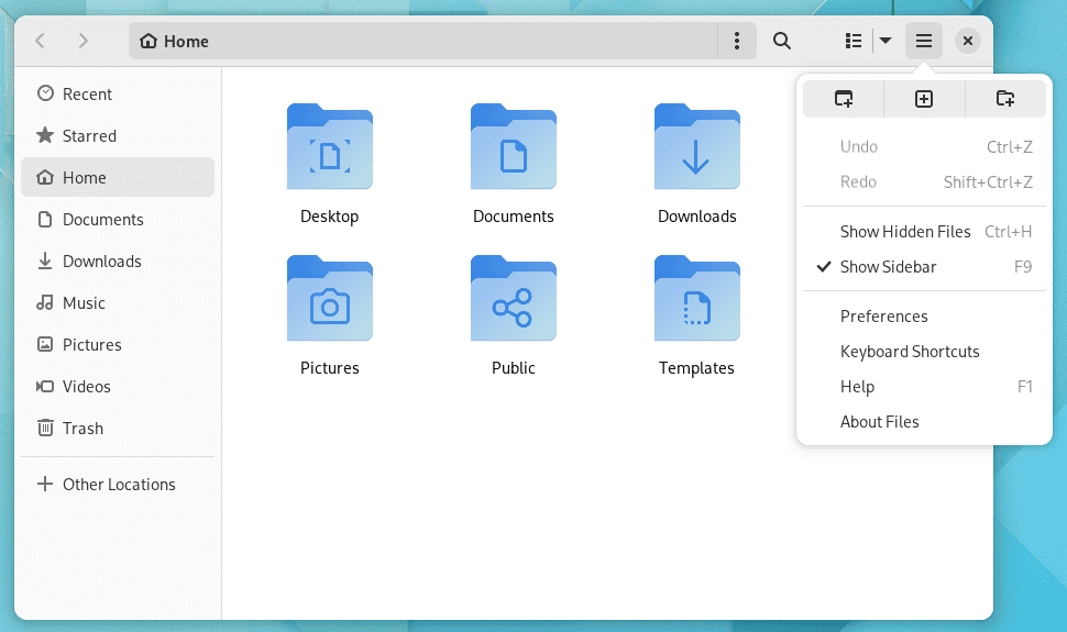
As we have all noticed, even though GNOME focuses on providing a modern desktop experience, the original folder icons looked dated. GNOME 42 changes that. It brings newly colored folder icons in blue.
System-wide Dark Theme
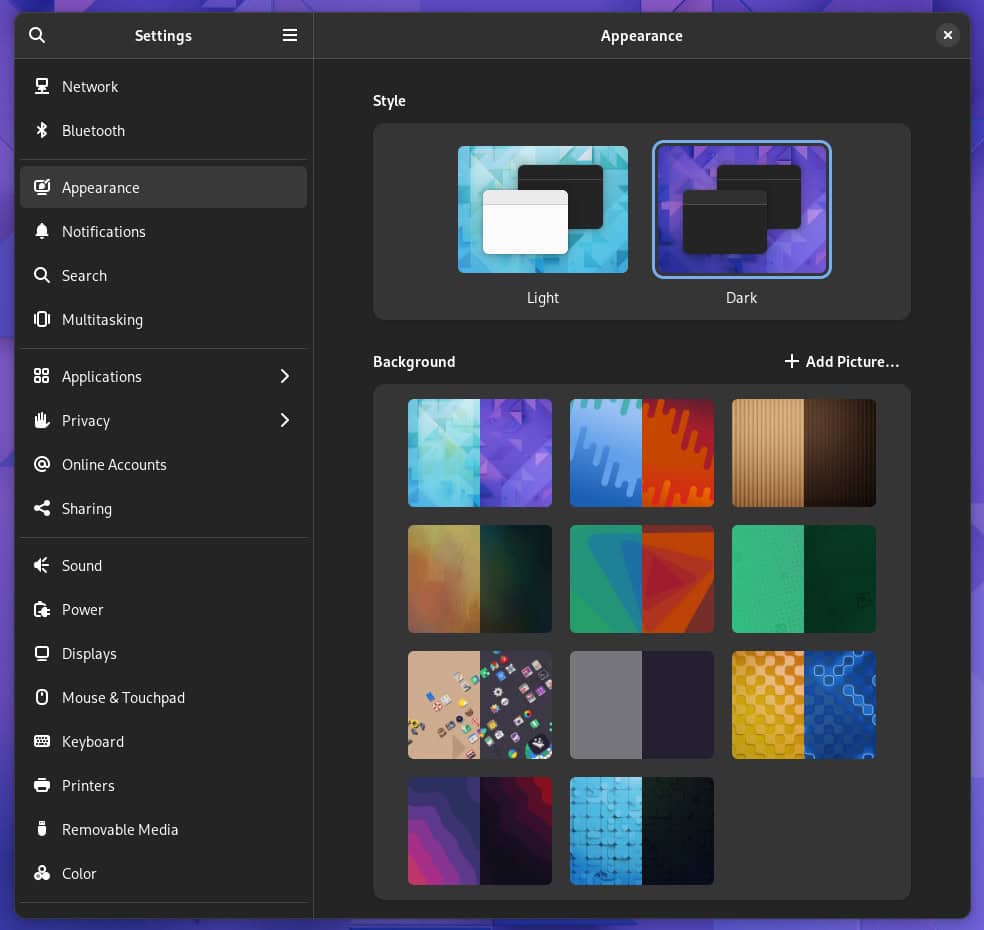
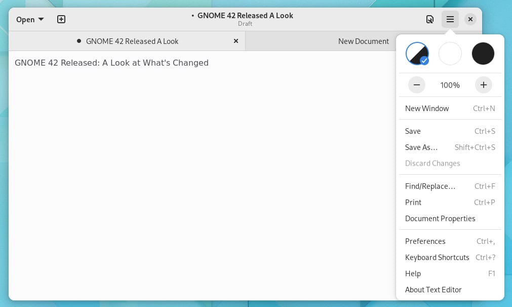
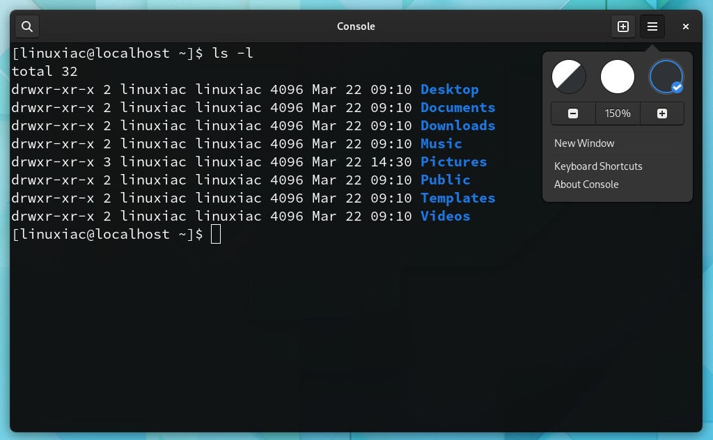
This release introduces system-wide dark style preferences as the most visible GNOME 42 feature. This means that you now have a switch that, when turned on, the entire desktop and applications that support a dark theme will automatically change to a dark style.
Applications must be able to access that option and respond accordingly to respect it. So there’s a lot of porting to be done on the apps side.
Additionally, each built-in wallpaper has both light and dark mode switches automatically when you change from light to dark mode or vice versa. Switching between light and dark modes fades in and out.
New and Replacement Apps
GNOME 42 includes some new and replacement apps. The modifications to the applications aren’t merely aesthetic. In some instances, the applications are entirely new.
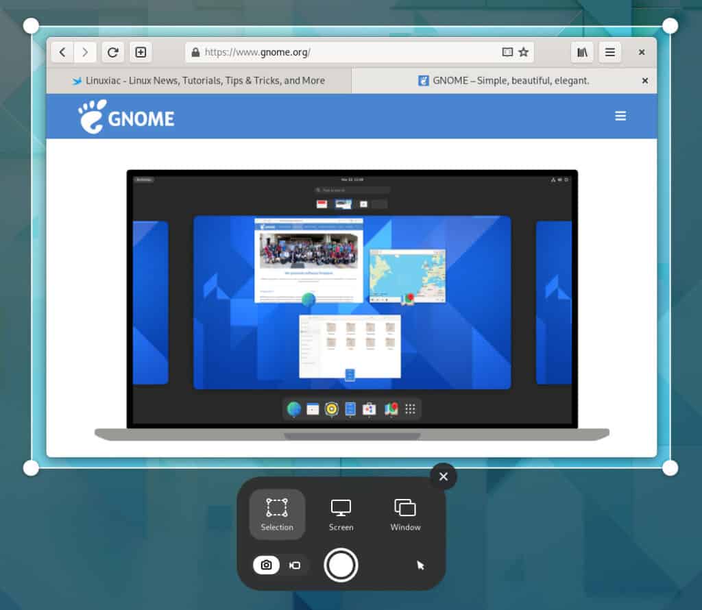
With GNOME 42, the user interface of the GNOME Screenshot app has received some major changes, including the ability to record the screen.
When you press the PrtScn key, your desktop dims, and a highlighted rectangle appears in the center. This rectangle can be stretched and moved to match the area you want to capture. Unfortunately, it does not offer a delay before the grab.
Gedit has been replaced by GNOME’s new Text Editor, which supports new features and themes. While both strive to be simpler and easier to use than their predecessors, they still incorporate valuable new capabilities, such as autosave and a search tool in the open-file pop-over.
The new Text Editor offers many of the same features as Gedit, including highlighting the current line, displaying a mini-map of your existing file on the right-hand edge of the editor window, and picking a color scheme in its “Preferences” settings.
The beloved and well-known GNOME Terminal has also been removed. Instead, GNOME 42 comes with the new GNOME Console app.
Apart from those mentioned above, some additional changes also deserve to be noted here.
The GNOME Software tool has experienced a lot of changes. For example, it prioritizes exact matches in the search function and will immediately stop current software downloads if your laptop’s battery runs low.
On top of that, it can also identify whether or not your network connection is metered and only download updates if you switch to an unmetered connection.
Last but not least, we can’t fail to mention that GNOME Calculator, GNOME Maps, GNOME World Clocks, and GNOME Web Browser have all been ported to GTK4.
For detailed information about all changes in GNOME 42, you can refer to the release notes.
Get GNOME 42
Unfortunately, while GNOME 42 was released, most people cannot indeed run it yet. It should be default in Ubuntu 22.04 LTS “Jammy Jellyfish” and Fedora 36.
At the moment, you can take GNOME 42 for a spin by downloading the GNOME OS. Remember that this ISO image is not a complete Linux distribution. It only has the GNOME desktop skeleton with a minimal installation UI.
It is not intended for daily use, so you will probably want to use it in a virtual machine such as GNOME Boxes to take a look at it.
Regular users should wait for this new GNOME release to arrive in the stable software repositories of their Linux distributions. As usual, rolling-release distros like Arch Linux will see it first.
