openSUSE has quietly rolled out a major refresh to its website—well, to the home page, to be more exact (I’ll get into that in a moment). If you’re curious, head over to opensuse.org and see it for yourself.
Right away, the color scheme stands out, and honestly, that pale green works really well. The whole look feels cleaner and more modern, definitely closer to today’s design standards. I also really like the main navigation. It’s simple and easy to follow—just News, Desktop OS, and Server OS.
Unfortunately, that’s about where the good things with this redesign stops. Let me explain.
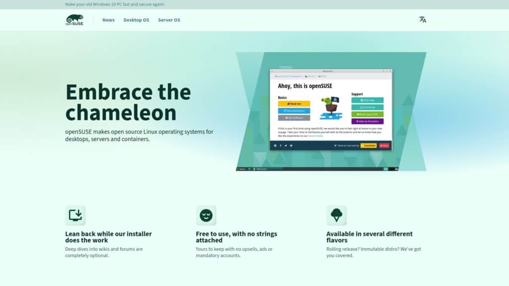
Above the fold (the part of a webpage that’s visible to a user without having to scroll down), which is considered the most valuable area of any webpage, we’ve got the slogan “Embrace the chameleon.” Sure, for those of us already in the loop, this might sound fun. But for someone like John, who’s brand new to Linux, this means… well, nothing.
In my opinion, it would be far clearer to take the Linux Mint approach with something simple like “What is Linux Mint?”—or in this case, “What is openSUSE?” Nothing more, nothing less.
The next big oversight, at least in my view, has to do with the distro’s flagship offerings. Think about it: for years now, Tumbleweed and Leap have been the core of what makes openSUSE… well, openSUSE.
Yet instead of being front and center, they’re tucked away further down the page, below a block of six cards and a breakdown of installer options, under a section labeled “Most popular flavors.”
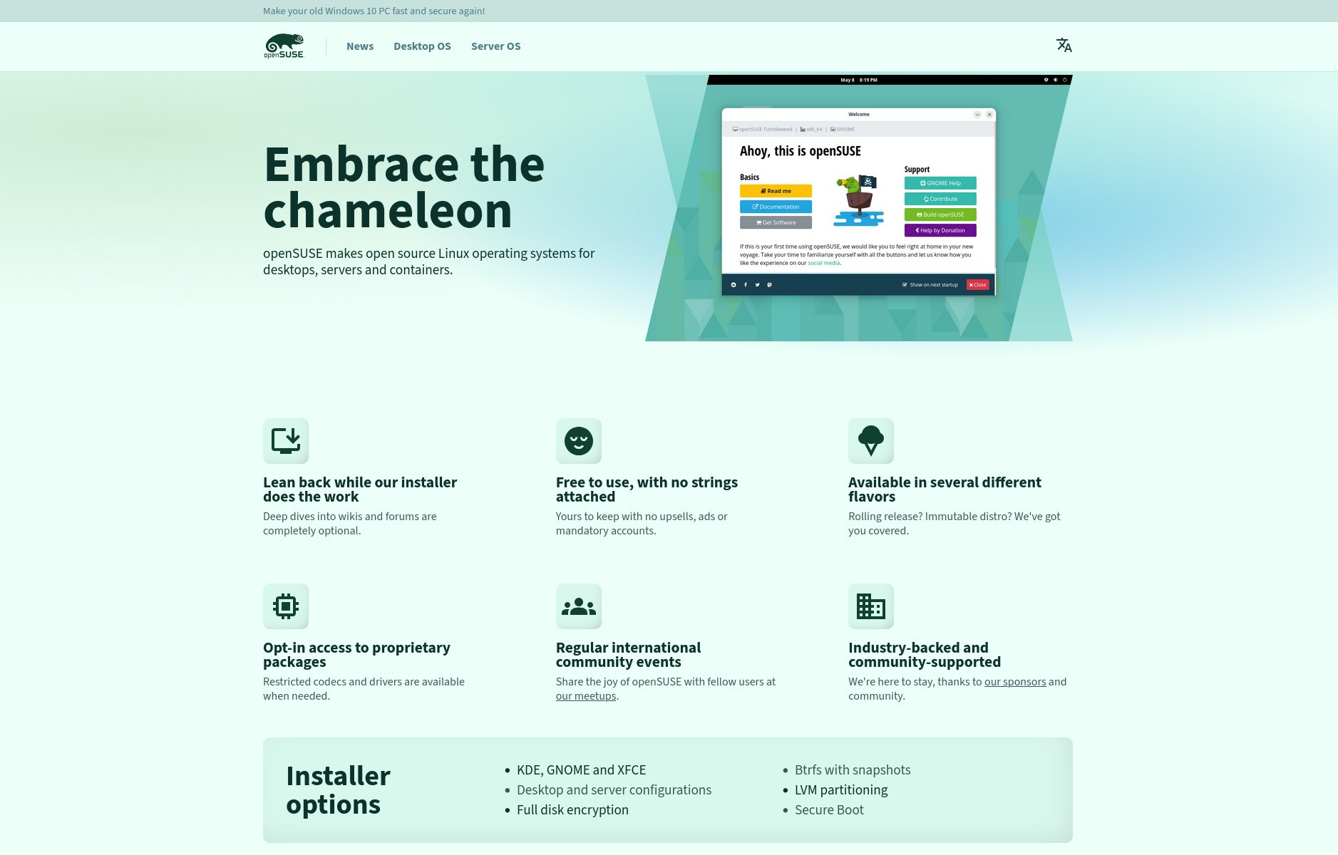
Honestly, what’s going on here? After the word “openSUSE,” the two others that matter most are Tumbleweed and Leap. So why are they treated like secondary details? That just doesn’t make sense. Not to mention, Aeon (an immutable still-in-development distro) also shows up in the “Specialized flavors” list, though I’m not even sure it’s still actually part of the openSUSE project.
And now, back to where I started. The openSUSE website redesign really only applies to the home page. Once you click away from it, everything looks the same as before. The problem is that this lack of consistency feels confusing—almost like the site is just a bunch of separate pieces loosely stitched together, with no real connection between them.
It’s hard to understand why a project with openSUSE’s reputation would roll out a redesign for just one page, leaving the rest untouched. If this were the site of some smaller distro run by a single passionate developer, it would make sense. But we’re talking about openSUSE here. And when expectations are set that high, people naturally expect the presentation to live up to them.
With that in mind, there’s really no need to dive into why the redesigned site prominently features the old “Ahoy, this is openSUSE” welcome greeter—especially since the distro just announced a newer, more modern replacement a few days ago.
In conclusion, giving the openSUSE website a fresh look is definitely a step in the right direction. Other popular names like Linux Mint, Fedora, and Manjaro have already modernized their online presence in the past couple of years, so it makes sense for openSUSE to follow suit.
That said, the current redesign still leaves plenty of room for improvement if the goal is to have a website that reflects the quality of the distribution itself, which, without any doubt, is one of the best in the entire Linux ecosystem. Hopefully, with time, these rough edges will get smoothed out and the site will truly live up to what openSUSE represents.


Typical UGLY monochromatic (dumbest thing ever) site, there is nothing “clean” or “modern”, just clean of any design, If I take openSUSE only by site like this I’d rather move along…
(Yes, Mint’s site looks much nicer)