Mozilla, best known for its open-source Firefox web browser and Thunderbird mail client, has unveiled a bold new rebrand. According to Mark Surman, Mozilla’s president:
Since open-sourcing our browser code over 25 years ago, Mozilla’s mission has been the same – build and support technology in the public interest, and spark more innovation, more competition and more choice online along the way.
The new rebrand aligns with that mission, giving people a renewed sense of empowerment as they engage in digital spaces.
To create its new visual identity, Mozilla teamed up with renowned branding agency Jones Knowles Ritchie for this transformation, working to emphasize the organization’s broader impact beyond Firefox, its most recognized product.
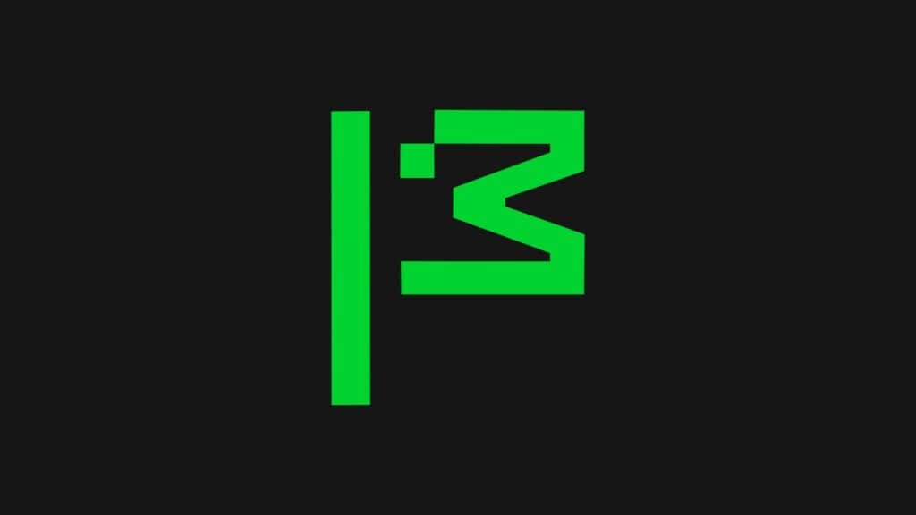
At the heart of Mozilla’s new visual identity is the flag symbol—an emblem of activism that stands for the promise to “Reclaim the Internet.”
This design draws on Mozilla’s unique combination of advocacy, innovation, and user-focused values. The stylized green flag, represented by geometric shapes, conveys a modern sense of unity and team spirit.
The updated visual language incorporates elements like a custom semi-slab typeface, a versatile green palette, and modular icons inspired by the flag symbol. Together, they create a distinctive identity that helps Mozilla stand out amid a sea of generic tech logos.
For comparison, here’s the logo that represented the company over the past seven years, from 2017 until now:
The rebrand also aims to simplify Mozilla’s message to its users, bridging the gap between tech innovation and the everyday internet user.
By blending bold, clean typography with a structured yet adaptable design, Mozilla makes its values—privacy, inclusivity, and openness—more accessible and tangible.
According to the company, this move is part of Mozilla’s broader ambition to foster a healthier internet ecosystem, tackling challenges from privacy breaches to misinformation.
Curious to explore the new brand further? You can learn more about it by visiting the official announcement. For a deeper look at the creative work behind this rebrand, visit jkrglobal.com.


Brave or Floorp. Not Moozilla
The article is about Mozilla, not Brave of Floorp. I would guess if Brave of Floorp does something noteworthy it will get an article too. Learn to stick with the subject.
Thank you to Bobby Borisov for such an interesting article.
he is saying they are way better then firefox and they both have done way more regarding privacy then mozilla is even capable of. mozilla has gone downhill and should be 10 times better then it is with all the money they take in but instead they waste tons of money.
Who trust those guys and their marketing/ad + data selling campaign?
This is the most ridiculous thing I have seen, Focus on a better products with better functionality, and not some dumb logo that coveys nothing. It will not help make more people like or desire your product. Is this a April fools joke or what ?
I only use privacy focused forks of firefox since I no longer trust mozilla. A logo change will not change how I think of them. I wish distros would move to more privacy focused browsers for the browser they include after a fresh install since all distros seem to be supporting data collection with default settings by including this.
I do to, I use Waterfox and Librewolf, but I realize they wouldn't exist without Firefox.
Looks like a Mozilla for I3 wm. When looking at the green flag.The green flag remembers also the head of Mozilla. In a more abstract way.Colored logo means more joy. And green is mainly symbol of hope and ecology.The whole logo looks more modern. And carry more concept.The old black and white was more 'terminal' era, Inmo.
I think it looks stupid