
The KDE desktop has long been known for offering nearly limitless customization, but one option has always felt oddly missing: the ability to adjust frame border intensity and contrast for Breeze-themed UI elements, letting users make frames more subtle or more pronounced according to their preference.
That will finally change with the upcoming 6.6 release scheduled for February 17. While Plasma 6.5 delivered a major visual step forward with fully rounded window corners, not just at the top but also at the bottom, Plasma 6.6 will stand out for this long-awaited addition. For many, it may seem subtle, but it’s the kind of refinement that makes the desktop feel really awesome.
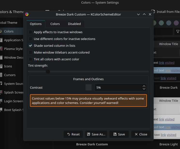
The new frame border intensity control builds on recent work to make KDE Plasma’s visual style more customizable and accessible. With this feature, users can configure how bold (or how faint) the outlines and frames around panels, widgets, and other Breeze interface elements appear.
This adjustment supports a range of preferences, from minimal visuals that blend elements together to high-contrast outlines that provide clearer visual separation.
According to KDE devs, the setting allows users not only to increase frame intensity but also to turn frames off entirely by setting contrast to very low values. This flexibility benefits both those who prefer minimalist interfaces and those who require stronger visual delineation for accessibility.
Let me show you exactly how this looks, using screenshots published by Nate Graham from KDE, so you can see the difference for yourself.
The underlying technical work involved making the frame contrast value user-modifiable across various components, including QtQuick windows, QtWidgets with Breeze styling, and Plasma SVG files.
Previously, frame outlines were calculated using a hardcoded value, which limited user control. With the new setting in place, Plasma 6.6 reads a configurable frameContrast value from the system’s color scheme configuration, allowing the entire desktop to adapt based on user choice.
Plasma 6.6 will also bring many other improvements, such as expanded hardware support for content sharpness adjustments when paired with compatible kernels and GPUs, though that enhancement is separate from the frame border control feature.
As I mentioned at the start, there’s just over a month left until the final stable release. When it arrives, as always, I’ll cover it with a detailed review of everything new and improved.
Image credits: KDE Blogs


KDE developers spent an awful lot of time on implementing these kinds of (mostly) cosmetic features, ornemental features, decorative aspects of interface: rounded corners, box shadow with blur capabilities and now frame borders. I am not against these if and only if they can improve and increase the coherence of consistency of the “look and feel” of an appication.
What KDE developers have *_not_* been doing is improving the usability of application and usability of interface. And one is removing scrollbar configuration and even removing scrollbar by replacing it with sliders. If you think I am exaggerating…:
New scroll bar width: cofiguration missing and inconsistent with GTK theme
https://bugs.kde.org/show_bug.cgi?id=375051
Cannot change scrollbar size (width)
https://bugs.kde.org/show_bug.cgi?id=94869
customizable scrollbar width
https://bugs.kde.org/show_bug.cgi?id=23491
Resizable scroll bar width
https://bugs.kde.org/show_bug.cgi?id=159055
When scrollbars have been made – by default – transient or very thin or replace with sliders without possibility of user-settable configuration, everywhere users have complained and have filed bug reports with relevant comments. Everywhere:
https://www.gtalbot.org/linux-section/maintenir-votre-Linux-Kubuntu/largeur-barre-defilement.html
Dear sir,
“frame border intensity”: I think you mean and are in fact referring to frame border width and frame border color. And such border separate panels or interface regions or sections or controls of an application.
“major visual step forward with fully rounded window corners, not just at the top but also at the bottom”: personally, rounded window corners are just (or mostly) decorative, ornemental and cosmetic aspect of an interface. I do not see much importance or significative value to this, especially from an usability perspective. Though, it has a significant value when speaking of coherent “look and feel” of an interface: users want coherence and consistency with the “look and feel” of an interface.
“provide clearer visual separation”: yes.
“using screenshots (…) you can see the difference for yourself.”: in those screenshots, it is barely noticeable. Because the frame border width is hair-thin.
“frameContrast”: this is not the best name for such property. frameBorderContrast or even frameBorderColor would have been better in my opinion.