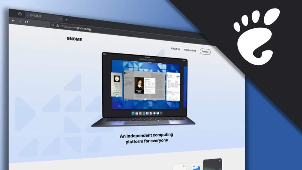
Without much fuss, the GNOME project has rolled out a brand-new website, and it’s looking great. The updated vision highlights minimalism, simplicity, and accessibility—ideas that the project fully embraces.
The refreshed vision also highlights GNOME’s ecosystem, including the GNOME Circle—a certification and mentoring program for well-designed apps built for the GNOME platform—and Flathub, the Linux app store where users can access a plethora of third-party applications compatible with GNOME.
Everything looks sleek, minimalistic, and well-organized—totally free of clutter, which is great! But two things immediately stood out to me.
First, the welcome slogan: “An independent computing platform for everyone.” Now, for you and me, it’s obvious what GNOME is. But for a first-time user, that phrase feels more like a generic marketing tagline rather than a clear explanation of what GNOME actually is.
Just as a quick comparison, KDE’s welcome slogan is “The next-generation desktop for Linux.” That one leaves no room for confusion—you instantly know what’s being offered.
Another thing that immediately stands out is the favicon in the browser tab.
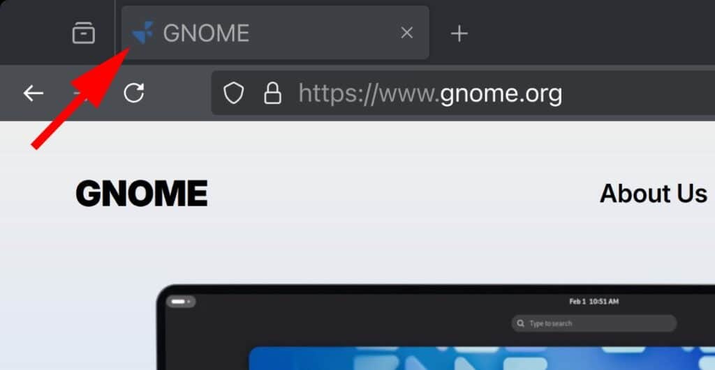
I have to admit, I have no clue what this geometric design is supposed to represent, but I really miss the familiar footprint symbol. Plus, in the new version of the site, it’s completely gone from its usual spot in front of the brand. Kinda weird, right?
Anyway, congrats on the new design! I’m sure it’ll appeal to plenty of fans of this desktop environment. Change is always a good thing, and GNOME holds some unforgettable memories for me—especially when they made the big shift to what we now know as GNOME 3. Interpret that however you like.


Inmo, The Next Generation… towards more to Star Trek fans…Independent….maybe the Rebel Alliance… (Star Wars).
Maybe the new linux user, Gnome makes think of Gollum, in Lord Of The Rings 😂
More seriously, I agree these are marketing slogans.
Lately, I discovered the Gnome(46) wayland session in Ubuntu 24 LTS use very low memory.
Btw, I mostly use Arch Linux 😉